In this section, you will find a quick overview of how data is used in journalism, a rundown on simple functions and math you can do with Google Spreadsheets and an overview of the most typical charts that people use and how you can make basic versions of them.
We live in an age of unprecedented data. Government bodies are releasing more and more of it and are creating portals for easier access. Company documents and PDFs live online that used to be in the cabinets of their offices. You yourself are producing thousands of data points - on social media, on smartphones and through other online activities.
What's more is that it's (sometimes) formatted in ways more accessible to us than ever before. Most data are online.
Advancements and the availability of technology have made it possible for much more people to process and make sense of this data. There are free tools like Open Refine that help you clean data. Google Spreadsheets — an excel equivalent online — Can help you sort all kinds of data.
But with all that data out there we need to develop a sense of what to do with them. How do we know which data sets are the right ones to use? How can we understand them beyond what is given?
Well, making sense of data means taking a bunch of facts, sorting them and arranging them so you can start seeing trends, patterns and relations. You will then take these arranged facts and visualize them in a way they make sense to your audience.
On this site, you can learn where to find data and how to find the right kind of data, beyond what is already available online. You will learn how to find, process and analyze data. You will also do some old-fashioned reporting by picking up the phone or visiting the offices of experts who will help you shape your analysis.
Data literacy is a vital tool in today's newsroom. If you can approach your reporting with a basic or even advanced understanding of data journalism, you're stories will likely be much more solid and will have a better chance of getting approved by an editor.
Too many journalists are afraid of math. But math is your friend.
Perhaps a good way of understanding how one can best use data in journalism. Data has found many ways into journalism and here are a few categories that will hopefully help you understand better how to integrate data into your stories.
Data as a way to find stories
You can use data as a starting point for many stories. If you are looking at a large data set and you find anomalies or trends in your data, this can serve as a way for you look further into an issues or a subject.
Data for data's sake: Making data sets and/or making them accessible
You can aggregate data and make it available to others in searchable or more accessible formats. This includes gathering data about a subject from around the web, from pdfs, requests for information and reports from institutions; but also finding and creating entirely new data sets (via code, phone calls or good old shoe-leather reporting).
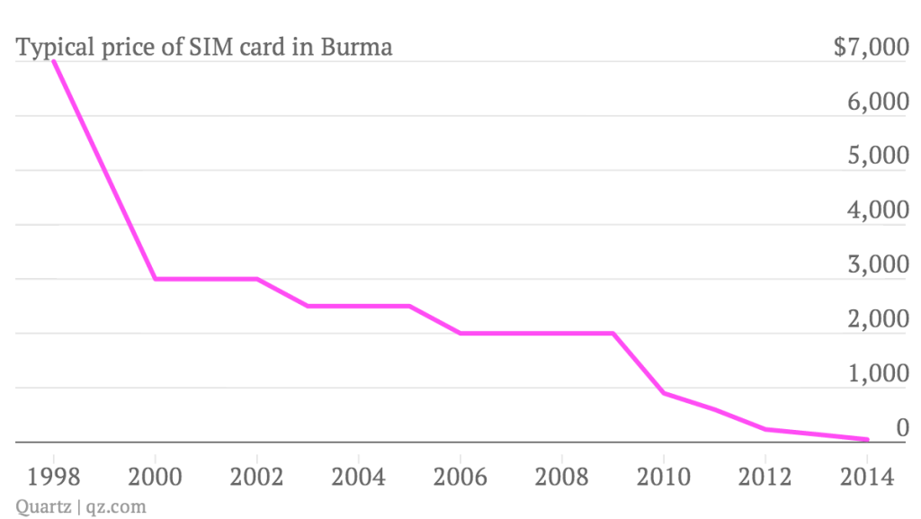 This graphic includes data that the reporter found through a combination of reporting and reports.
Graphic courtesy of Quartz
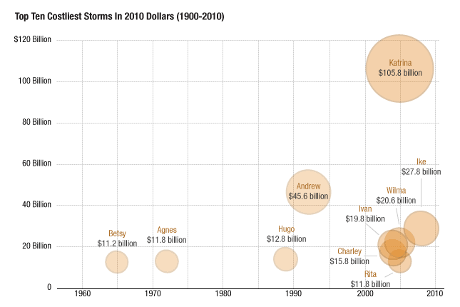
This graphic includes data that the reporter found through a combination of reporting and reports.
Graphic courtesy of Quartz
Data visualization, interactive graphics and maps
Data visualizations and interactive graphics have increasingly become a way in which journalists tell stories.
This can be through smaller graphics that take maybe 1-2 hours to make, like this chart:
 Source: Planet Money
Or through larger and more ambitious interactive graphics like this one:
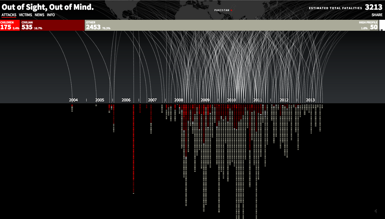 Source: Pitch Interactive
Or maps like this one:
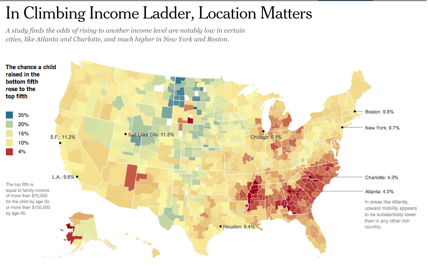 Source: New York Times
Making chart takes several steps. While many people might be intimidated by actually producing and designing a chart, most of the work in making a good chart or graphic lies in finding, cleaning, sorting, analyzing and formatting the right kind of data. In other words, a successful chart requires a lot of behind-the-scenes work.
This graphic can give you an idea about the steps involved in maing a chart:
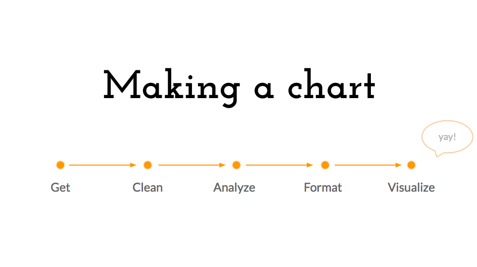
In the following sections we will talk about those steps.
There is this misconception that having a lot of data automatically means having many great stories to tell. There is, indeed, a lot of data out there. But that means nothing when you can't understand and process it in a way that surprises your audiences, spurs their thoughts and makes them realize something they hadn't known before.
Data are collected through surveys, forms or even through algorithms that collect information from the web or from massive spreadsheets. In short: Data are interviews done by humans or 'robots' on a massive scale but conducted by someone else.
If someone else did your reporting for you, you would want to know who they were, how they asked the questions and why they asked the questions they asked. You have to ask yourself the same questions about the data you analyze.
One of the most important things to note is: what organization is publishing the data. What biases might they have? How thorough is their research and who paid for it? Organizations might have political affiliations or might be advocating for a certain cause. The data they publish might just be a way for them to support their own cause.
Whether it's think tank data or government data - a rule of thumb is to use the same judgment you would any other source. Would you quote that source or not? Just because data comes on a spreadsheet doesn't mean it can automatically be trusted.
One small tip: Next time you see an infographic from a trusted news organization, look at the small line on the bottom of the graphic -- in geek speak it's called the source line -- and see what source the reporters used.
Myanmar Census — Myanmar conducted its first Census in 30 years. These numbers include population counts and basic economic, social and demographic information about Myanmar's population.
Myanmar Information Management Unit — a team from the United Nations that publishes data and information from various sources on their web site.
Open Myanmar Initiative — They describe themselves as a "nonprofit orginization with the vision of promotion the right to information and education" and feature some reports on their web site.
United Nations -- The United Nations collects international data about anything from health, development in different countries, to refugee populations to food prices. It's one of the best sources for international comparisons.
World Bank -- The World Bank publishes great data and research about international, economic comparisons, anything from GDP numbers to populations.
OECD -- The Organisation for Economic Co-operation and Development collects comparable economic data about its member countries.
Check the data format first. Data comes in various file formats and you want to make sure you have data in a format that lets your manipulate and analyze it. This site is teaching you basics in Google Spreadsheets and Excel, which are best at handling files like the following:
XLS, CSV & TXT — Ideal formats are excel files with file extension .xls or .xlsx and comma separated files with file extension .csv. These files contain data that excel can easily read.
XLS — XLS stands for excel files. Those are files made for and processed with Microsoft Excel.
CSV — CSV (Comma-separated values) and TXT files are formats that contain delimited text -- which means that your data is separated by a delimiter (a delimiter can be a comma or a tab). They are readable by many different software and online applications but also by Excel.
Less useful are these formats, even though many organizations use them:
PDF and HTML — Sometimes data comes in PDFs and HTML tables, which are great for displaying data in tables but can be a pain when you want to manipulate data. Getting data off a pdf can be somewhat complicated but there are some ways to do it. In this lesson you will learn one way to do it.
If you get very interested in programming, coding and web development, you might also find these data types interesting:
Machine readable file types — During your research you might also come across other file types that contain data, like JSON files and XML files. What you need to know about them is that they are machine-readable and are useful when making interactives.
Other editorial guidance when working with data
Data sets are usually riddled with jargon. Instead of calling a person a "part-time employee who wants a full-time job" the bureau of labor statistics calls them "part-time employed for economic reasons." Instead of calling a person an immigrant, the census bureau calls him or her a "foreign-born" person.
Many of these terms are cryptic. And If you don't understand the categories in your data sets, then chances are your viewers won't either. Your job is to translate that jargon for your audience.
If you can't find anyone straight away, you can also search for a glossary of terms on the same site that contains your data. Do try to get a person though and be insistent: their knowledge is often much deeper than what is offered online.
Here's the most common mistake people make when they make a graphic: they see a spreadsheet and assume that they have a story. But finding a data-driven story takes the same work as finding story for an article. You want to be inquisitive and make sure you find something interesting within your spreadsheet. Here are a few questions you want to ask yourself when you are trying to find a data story:
There are basic things you can use to ask the above-mentioned questions of data.
A few important principles to keep in mind before starting to analyze data is that you want to keep an original version of all your data. One of the most important things with data analysis is that you want to keep an original copy of your data set in the same folder that you create for your data project. We should make sure we can go back to the original data set, in case we make a mistake along the way.
Then you need to make sure you document each step. One of the biggest things in dealing with data is that we humans are fallible. We should triple check our data manipulations and our data calculations. Because of that, you should make sure that you separate and document each step in your data analysis, so that you can always trace back your steps.
One method in which you can do that is by creating a new sheet for each step. Please refer to this example to see what that could look like.
Below are a few descriptions of what you can do with data using free tools like Google Spreadsheets and Open Refine or paid tools like Excel.
Cleaning and organizing data
Sometimes data does not come in ways that you want it to. Sometimes there are issues in how the data is sorted. Sometimes there are issues in how the data.
Filtering and sorting — one of the most useful things you can do to understand data is to sort it, mostly by size of the value (largest to smallest or vice versa), by the time the data occurred (also known as a time series) or by the type of information it is.
Open Refine — this tool allows you to look through larger sets of data and correct things like various spellings for the same township. It's a free tool that you can download here and there are various wonderful tutorials about it online, including this one provided by the news non-profit organization ProPublica.
Calculations
Data points aren't always categorized how you want them to be. Sometimes categories are clustered together in a way that doesn't serve your story. Other times you need to combine several categories to make your story clearer. This is part of your reporting: you need to assess the data set that was given to you and arrange in ways that make sense.
Excel and Spreadsheets allow you to do basic math with your data. That includes adding, subtracting, multiplying and dividing numbers. You do so by inserting what excel calls "formulas" into cells. It's particularly useful when you need to combine cells or when you need to find percentages.
Whatever calculations you make, be very thoughtful about them. Make sure you asked yourself what story you want to tell before you do any math. Your editorial judgment is crucial in getting a story out of your data and in making the right calculations to get to it.
You also need to make sure you completely understand what your numbers represent. And, again, triple check your math!
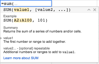
Formulas — there are many ways in which you can do basic math in Google Spreadsheets and Excel. Below are some of the most common, but you can either visit Google's page that details all the formulas supported by Spreadsheets or you can type in "=" (equal sign) into a cell and look for suggestions.
 This is how Google Spreadsheets uses
=A2+B2+C2 or =A2*(B2+C2) — You can do simple math with cells=sum() — This is a method that allows you to add several rows or columns of data really quickly.Pivot tables
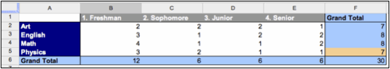
Pivot tables are a tools that Google Spreadsheet and Excel offer for you to analyze large data sets without having to use formulas. You can do calculations like counting catgories (like in the image below, which counts the number of students by age and field of study in a data set).
 Source: Google
Detailed step-by-tsep instructions for creating and using a pivot table in Google Spreadsheets can be found here.
Data visualization for analysis
While many people mostly think that data visualizations are made to be published on the web or in a newspaper, very simple data visualizations are also an effective way to analyze and understand data.
=Sparkline(A2:D2) — This is a way to make many little line charts Format data
It's important to recognize that visualizing data requires you to format your data in different ways. Sometimes that means that you need to create a list of numbers separated by a comma (remember CSV as a format!) and sometimes ta
=transpose(A2:D2) or TRANSPOSE({1,2;3,4;5,6}) — This is a method to transfer data from a row to a column and vice verse. In Excel, this same function, can be done with "Paste Special" and checking "transpose."Feel free to walk yourself through this data journalism and infographics course (just scroll to the end of the document for the lesson plan). More on data sourcing can be found here and specific information on data processing and analysis here.
The most important part to making a chart is getting great data that shows changes over time, reveals patterns over time or helps understand the relationship between one data set and another. Without interesting data your graph or chart won't contain a good story. You can refer to the data analysis and data reporting resources if you need assistance with that.
We will be using Google Spreadsheets to work make basic charts and graphs.
Log into Google Drive (Please get in touch with multimedia for login details).
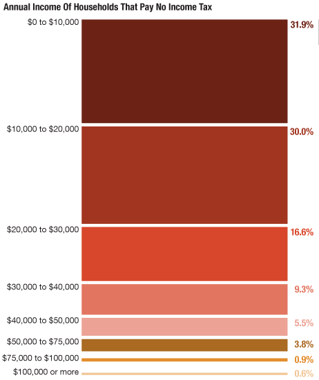
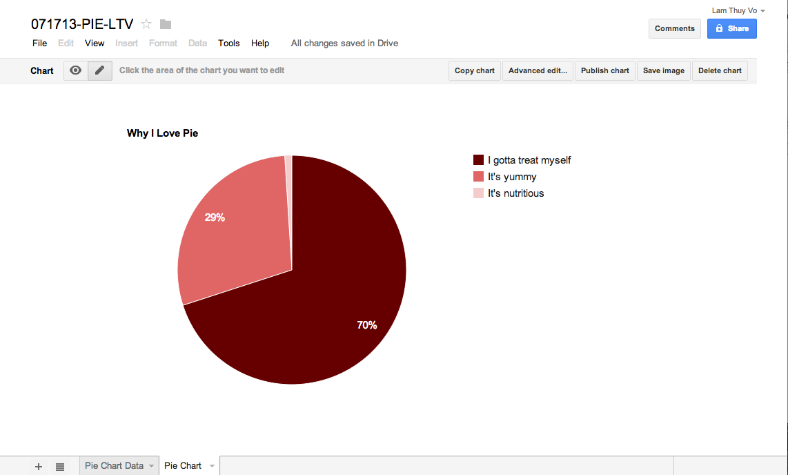
Pie charts and donut charts are great in showing proportions of categories within a whole. They are particularly effective when used with simple and straightforward data sets.
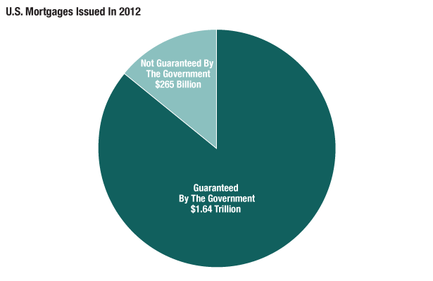
Source: Inside Mortgage Finance
Be wary, however, of visualizing a complicated data set. Once you try to visualize more than five different categories within a pie chart or donut chart you run the risk of confusing your viewer and muddying your message.
This means that at times you might have to consolidate data to build an effective pie chart or donut chart. Or it could mean that you need to find a different way to visualize your data.
If you would like to make a pie chart please use this pie/donut chart template.
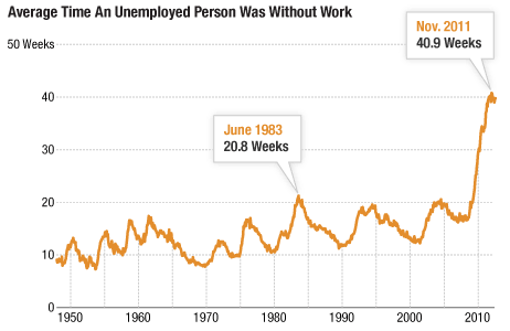
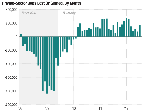
Line graphs are great in representing trends or interesting occurrences within a data set over time. The key here is that you can plot changes, patterns or unusual events over time. This line chart shows how much longer people are out of work than they have been previously:
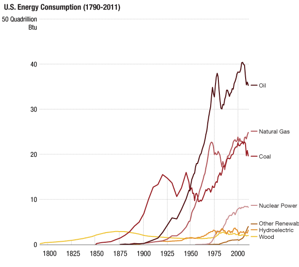
Another way to use line graphs is to show change within different categories over time. This example about energy uses over time shows us how much our energy consumption has increased and how much it was diversified as well:
If you would like to make an area chart please use this area chart template.
Area graphs show trends over time for data that are part of a whole. In some ways you could think of it as having the same function as a pie chart (showing proportions) but over time. This area graph shows the growth in disability awards over time by category
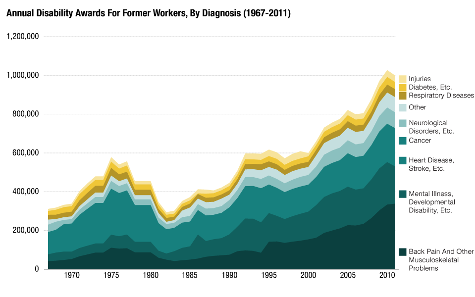
Source: Social Security Administration
If you would like to make an area chart please use this area chart template.
Column graphs are similar to line charts - they have the ability to plot values over time. But they are sometimes a better choice when you only have a sparse data set (yearly data instead of monthly data for a 4 year time span, for example). To plot a line chart with that sparse a data set can seem misleading - a line can sometimes lead people to think of trends within a data set when a column graph can seem as if it shows the yearly data in isolation.
Source: Bureau of Labor Statistics
If you would like to make a column graph please use this column graph template.
Stacked column graphs are similar to area graphs - they can show proportions within a whole over time.
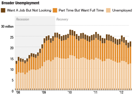
Source: Census Bureau
They can be a good alternative to a pie chart - especially if you have more categories than would be good to show in a pie chart.
Source: Bureau of Labor Statistics
If you would like to make a stacked column graph please use this stacked column graph template.
Bar charts are very similar to column graphs, they just face a different direction (column graphs are vertical, bar charts horizontal). They can display values of different categories and are also a good alternative to a pie chart if your data gets complicated.
One nifty way in which they are slightly different though is that you can use them to rank information. This chart here shows not just how many billions in treasury bonds each country held, but it also ranks them by how much they hold. This creates a clear hierarchy between those countries, an important piece of information when trying to understand who holds American debt:
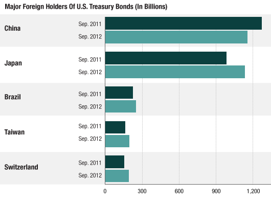
Source: Department of the Treasury/Federal Reserve Board
If you would like to make a bar chart please use this bar chart template.
For a stacked bar chart please use this stacked bar chart template.
Click "Use This Template" and input your data into the fields. Clicking this button will create a new Google Spreadsheet in your Google Drive.
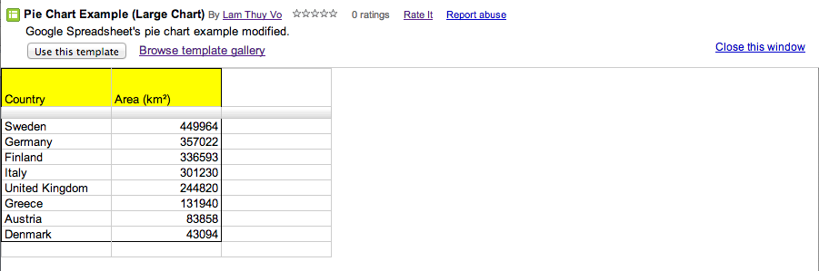
Once you have a copy of the template in the google drive you can change the title of the spreadsheet to MMYYDD-SLUG-NN (Date-Slug-Editor initials). You can copy and paste cells and add rows and columns as needed.
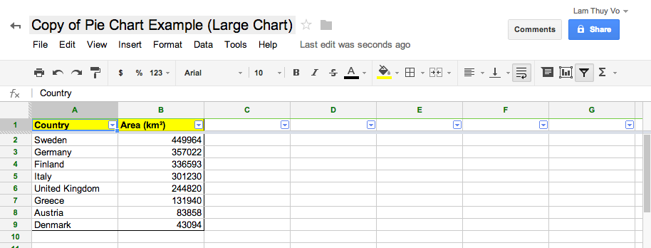
On the bottom you will see two tabs. Go to the second tab, which contains your graphic.
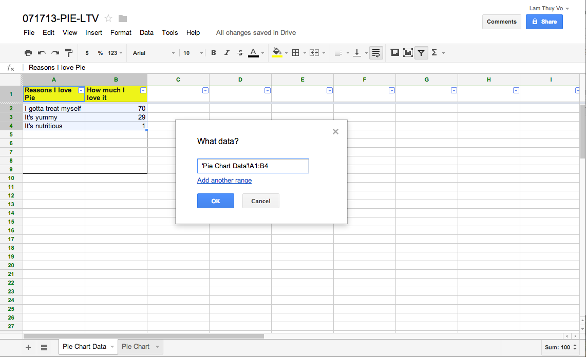
Then go to advanced edit. A window will pop up. Go to the first tab of the window called "Start". This window allows you to make sure the right data is selected for your graphic. Click on the little gray grid icon on the right under "Data - Select ranges..."
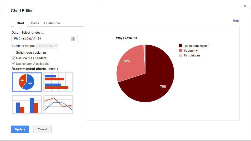
This is the pop-up window.
That should prompt a small window. Leave it open. Go back to the first sheet that contains your data using the left tab on the bottom. Click and hold down to select the cells and data you want to include in your graphic.
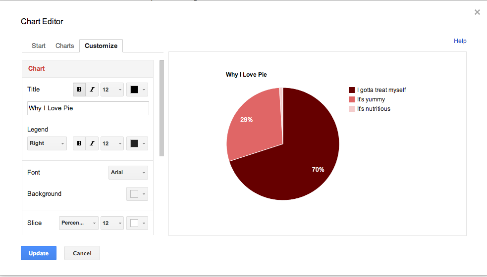
Now that you've selected the content of your graphic, you can style it. Go back to the tab the contains your chart. There are a few ways you can customize your charts. You can make visual edits to your graphic by clicking on the elements you want to modify.
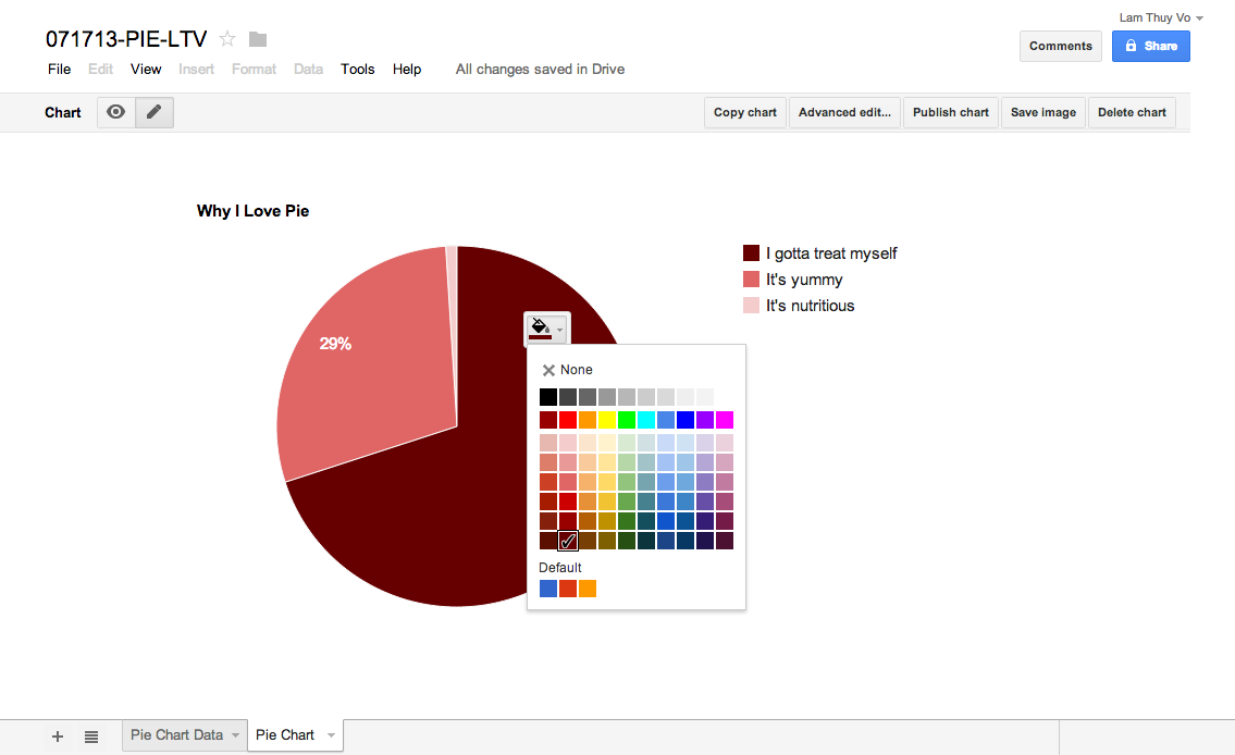
Another way to style your charts is to go back to the "Advanced edit.." pop up and modifying the chart within the "Customize" tab.
Now that you're happy with your chart you have to publish it by clicking "Publish chart." This window will pop up
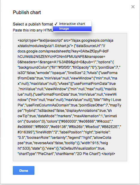
Select the dropdown menu that says "Interactive chart" and select "Image."
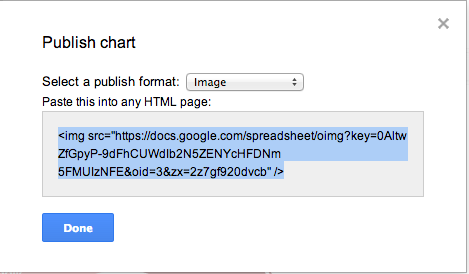
Copy and paste the code into a document. Add width="100% right after the link within your embed code. And a source line right after it. This is what your code should look like:
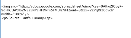
Source: Lam's Tummy
A step-by-step rundown of making charts is here. Editing and Formatting Charts can be found here. For information on specific chart types, go here.
